
Reimagining alerts and navigation for the nation’s largest ferry system
Project Snapshot
Deliverable
Content strategy and page mockups
Team
Six-person cohort, UW Certificate in Content Strategy
Timeline
4 months (Fall 2020)
Client
Mock client (real-world case, not directly commissioned)
My Role
Strategy framing, usability analysis, mockup design, presentation of solutions
The Challenge
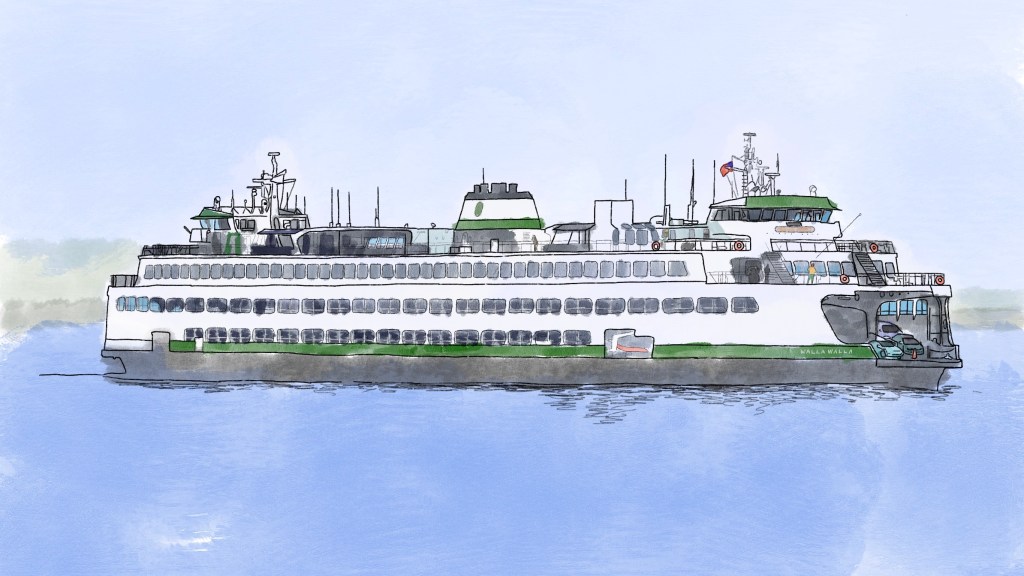
Washington State Ferries (WSF) is an iconic part of Puget Sound life, but for riders the journey often begins in frustration. Working as a team, we conducted user interviews and journey mapping to understand where the pain points were. Again and again, passengers told us they struggled to find timely travel alerts and schedules, often turning instead to Facebook groups, word-of-mouth, or outdated app notifications.
As one daily commuter put it:
“The app works 50 percent of the time, and when it does the information is not accurate.”
This lack of reliable digital communication undermined WSF’s mission to provide safe, accessible, and satisfying passenger experiences. Our project set out to imagine a content strategy that put clarity and usability first.
Research & Insights
To ground the work in real rider needs, we conducted user interviews, created personas, and mapped journeys.
- Persona: “Daily Dan,” a Bainbridge commuter who relies on ferries every weekday. He knows his schedule by heart but has little confidence in WSF’s ability to provide reliable alerts.
- Journey Map: Dan’s stress peaked before boarding — reloading his Orca card, checking schedules, and hunting for delay info.
- Content Audit: We found three major pain points:
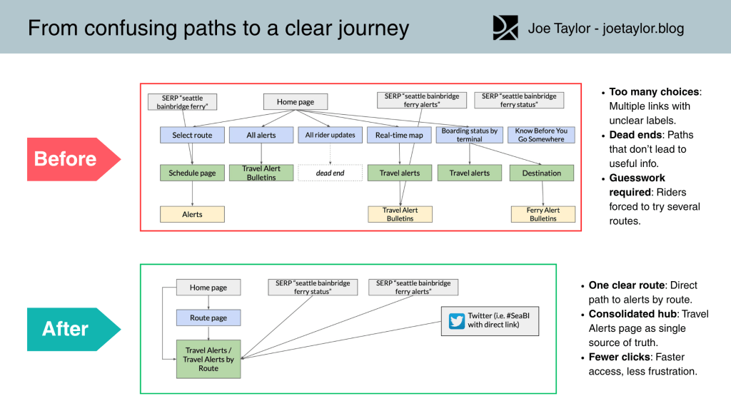
- Confusing navigation: The homepage offered overlapping links (“Ferry Alerts,” “Rider Updates,” “Live Status”).
- Disorganized alerts: Bulletins were not grouped by route or date and required unnecessary personal data for subscriptions.
- Overloaded schedule pages: Static tables buried in sidebar clutter, redundant links, and poor mobile responsiveness.
The consistency of these problems pointed to one clear opportunity: fixing how WSF delivers travel alerts and schedules.
Strategy Framework
We distilled WSF’s mission and rider needs into a practical but aspirational core strategy statement:
WSF’s content empowers passengers to embark on their journey with reliable and accessible information for an enjoyable and satisfying travel experience.
To support this, we recommended a voice that was informative, inspirational, and approachable, without jargon or bureaucratic tone.
Solutions & Mockups
With strategy in place, our team turned insights into design. While everyone contributed to research, I took the lead on translating strategy into mockups that showed how WSF could deliver clearer, timelier, and more usable content.
I created the homepage, route page, and travel alerts prototypes, ensuring they reflected both content principles and realistic UI improvements. In our final presentation, I introduced and walked through these designs, connecting each solution directly to the rider pain points we had uncovered. Contributing the mockups allowed me to translate our collective strategy into clear visuals that strengthened the team’s presentation.
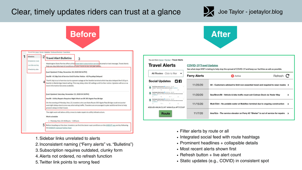
Homepage: One-Click Travel Alerts
The old homepage buried alerts in multiple confusing links. We simplified navigation with a single “Travel Alerts” button, leading to a redesigned alerts page.
Previously, alerts were scattered across multiple competing links — “Ferry Alerts,” “Rider Updates,” and “Live Status” — forcing riders to guess where to click. We consolidated all of this into a single “Travel Alerts” button, complete with a live count of active alerts, giving users one clear place to go for the latest updates.

Route Page: Consolidated, Readable, Dynamic
Route content used to be spread across multiple static pages with redundant links and confusing sidebars. Our redesign brought everything together into one streamlined page:
- Filter schedules by date and route in clean, scannable columns.
- Drive-up availability and vessel names shown clearly alongside each sailing.
- Dynamic Travel Alerts button with a live count, specific to the route.
By consolidating fragmented information and surfacing real-time details, the new route page makes it easier for commuters to find what matters most — quickly and with confidence.

Travel Alerts Page: Filterable and Scannable
The existing alerts page was static and overwhelming. We reimagined it with features designed for real riders:
- Filter by route or show all routes.
- Embed an active social feed with route-specific hashtags (e.g., #SEA/BI).
- Make headlines prominent with collapsible body text for easy scanning.
- Order by most recent and include a refresh function to boost user confidence.
- Highlight static updates (like COVID notices) in a consistent, visible area outside the feed.
This transformed the page into a single source of truth where commuters could get exactly the information they needed, fast.
Measuring Success
We recommended tracking both site-wide and page-level KPIs to validate how navigation simplification improved the rider experience:
- Simpler journeys: Fewer clicks and fewer dead ends, measured by a reduction in pages per session.
- Higher engagement: A greater share of homepage traffic flowing directly into high-value pages like route info and alerts.
- Improved satisfaction: Rider surveys and customer service data reflecting less confusion and fewer complaints.
- Stronger content signals: Lower bounce rates and better click-through from search results, showing that content is clearer and easier to trust.
Reflections
Because WSF was a mock client, we couldn’t implement or test our recommendations directly. But the project reinforced several key lessons:
- Consolidation creates clarity. Collapsing multiple entry points into one reduced confusion and improved usability.
- Clarity builds trust. Even small choices in structure and language can shape how confident users feel.
- Content is infrastructure. For public services like ferries, reliable digital communication is essential to the overall experience.
