
Project Details
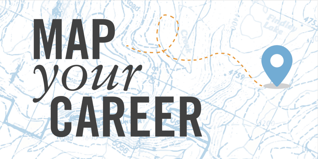
- Main Deliverable: Redesigned book and website for “Map Your Career” educational resource
- Team: Myself and a data analyst
- Timeframe: One year, Mon-Fri alongside other projects (June 2018 – June 2019)
- Completed For: Workforce Development Council of Seattle-King County
Map Your Career was not my project initially. The organization had been outsourcing design to consultants, and it was only when those efforts failed to meet expectations that I was asked to step in. I had just started to prove myself in graphic design, and it was risky but in retrospect it was exactly the right call.
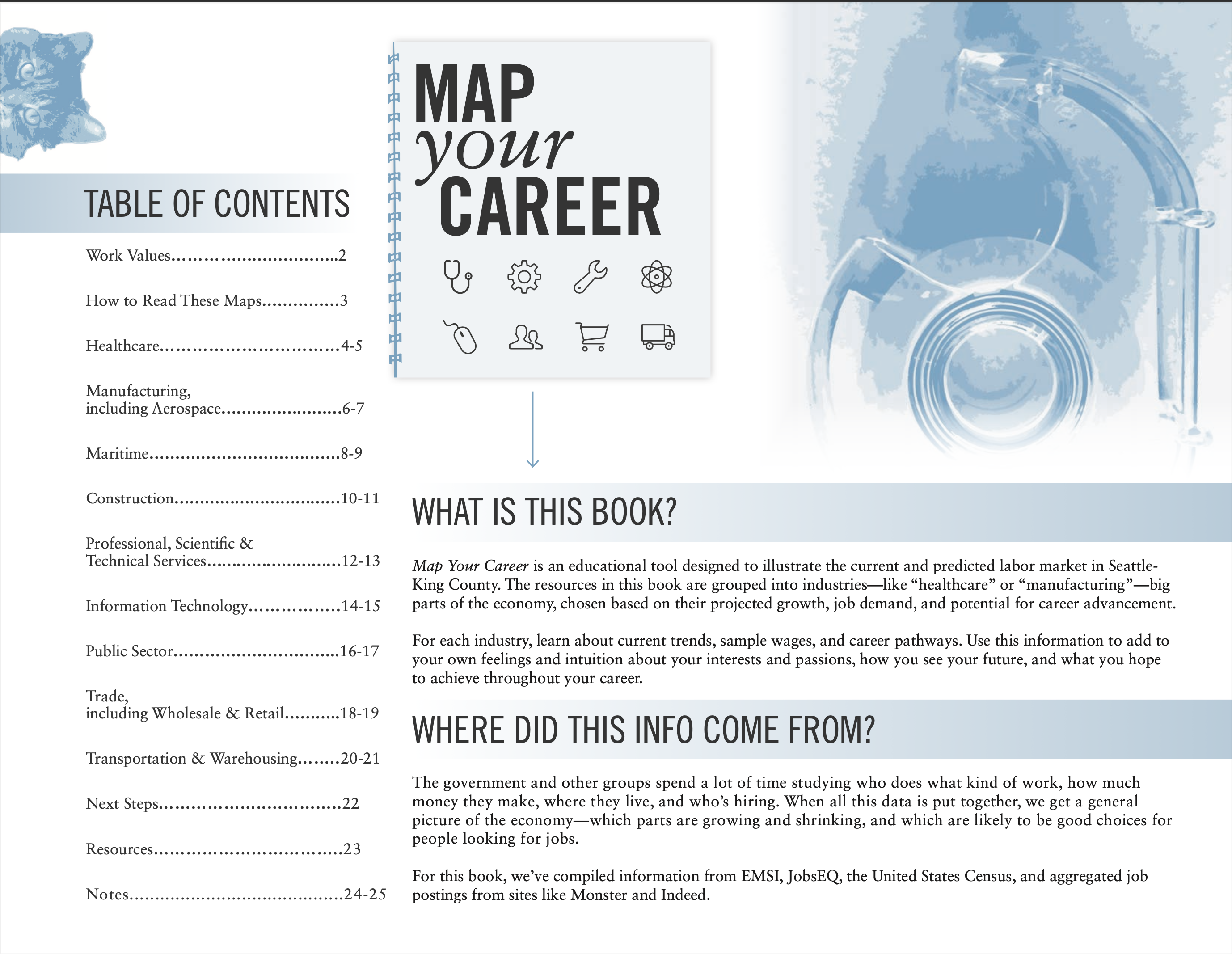
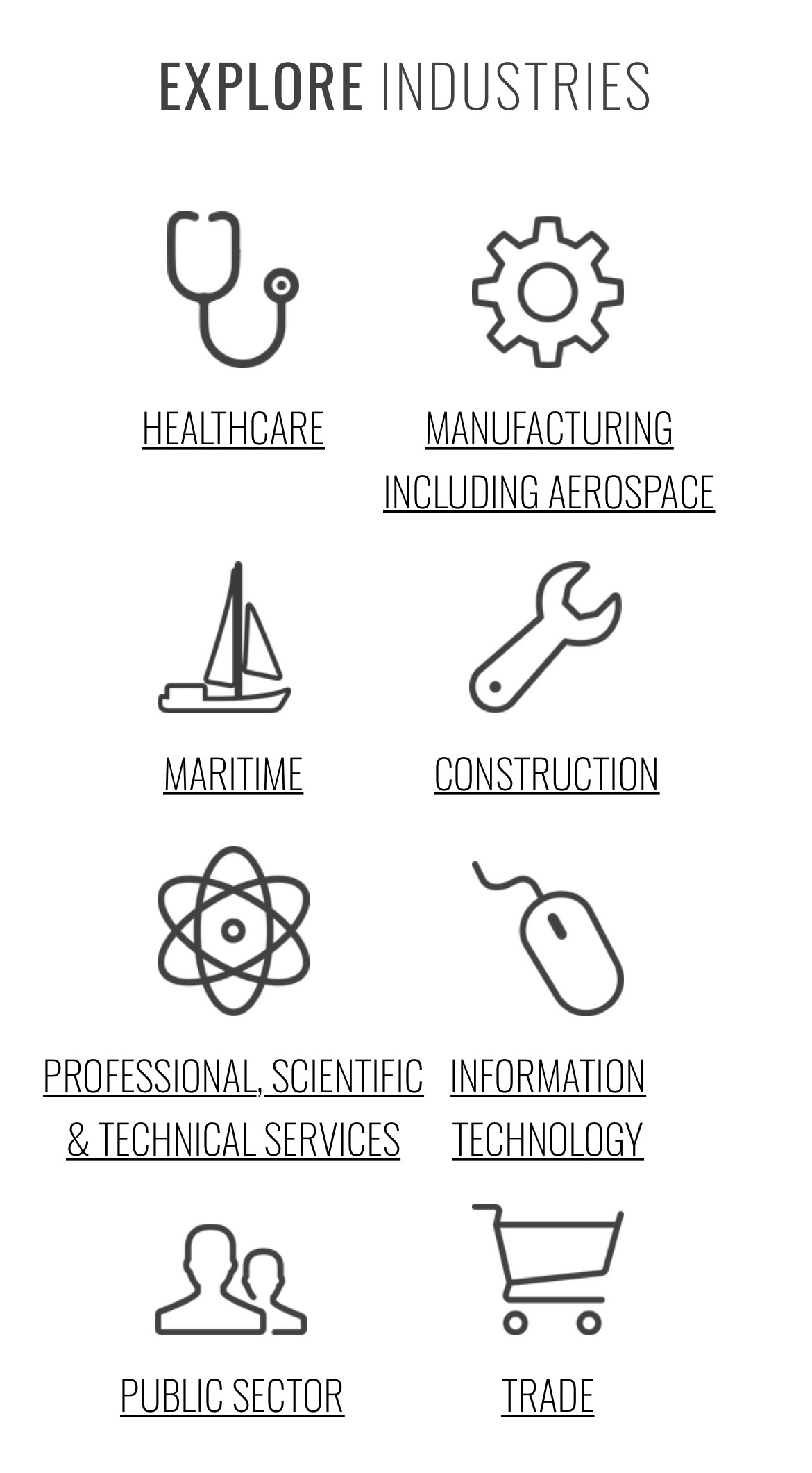
So, what is Map Your Career? At its most basic, it’s a career pathway guide. Starting a career as a young person is overwhelming, and the goal of Map Your Career is to take all the labor market information available about in-demand jobs and pathways and lay it out in a way that makes it easy to digest for a school-age audience.
When I started, the project was nearly ten years old and on its second iteration. The data was clearly in need of an update, but more pertinently, the design was not serving the accessibility goal. The career maps were wildly inconsistent from industry to industry, presenting an overwhelming volume of detail with a lot of labor market jargon. The book was designed in PowerPoint and looked like it, and the web version was extremely minimal, mostly serving to link back to the PDF of the book.
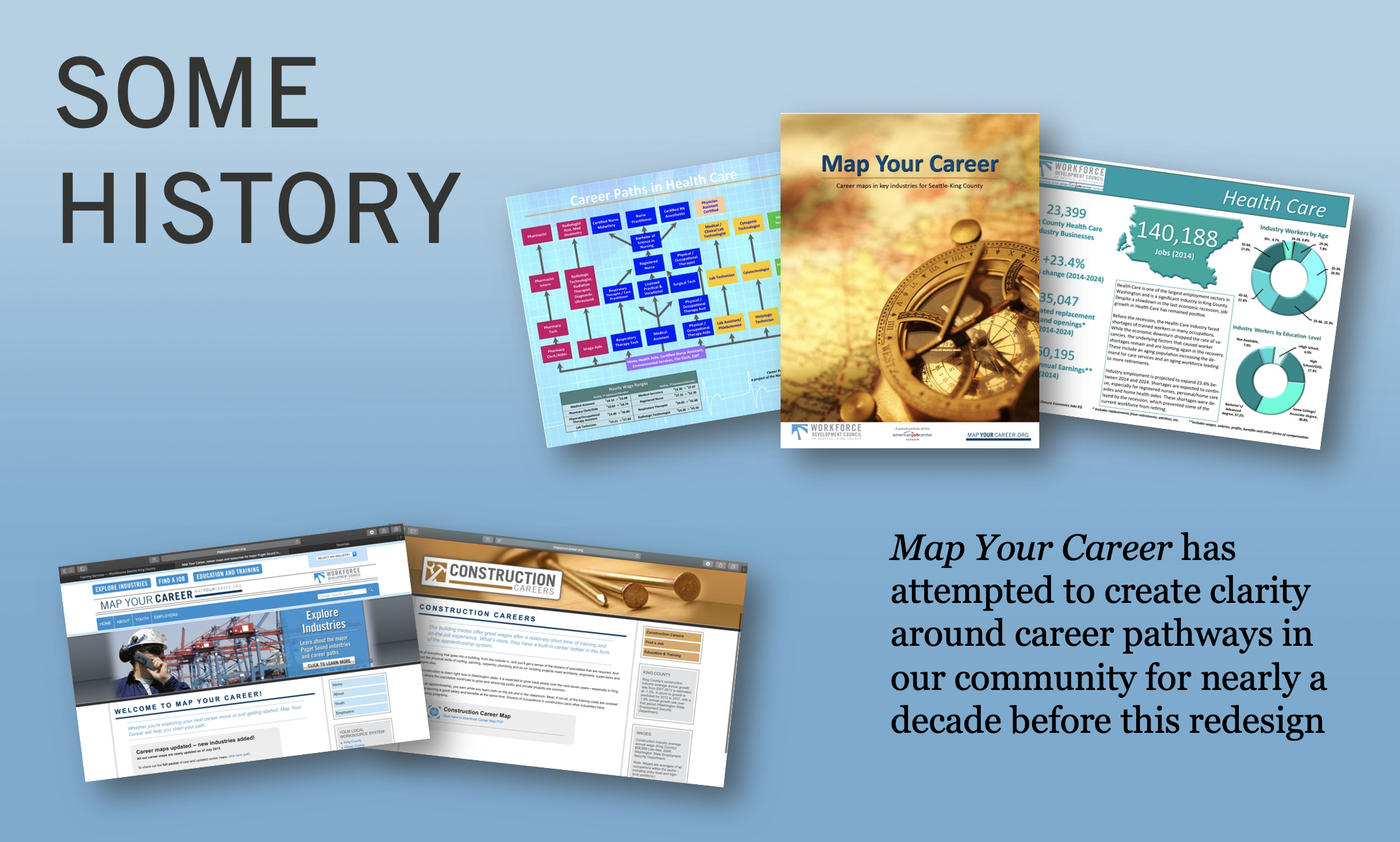
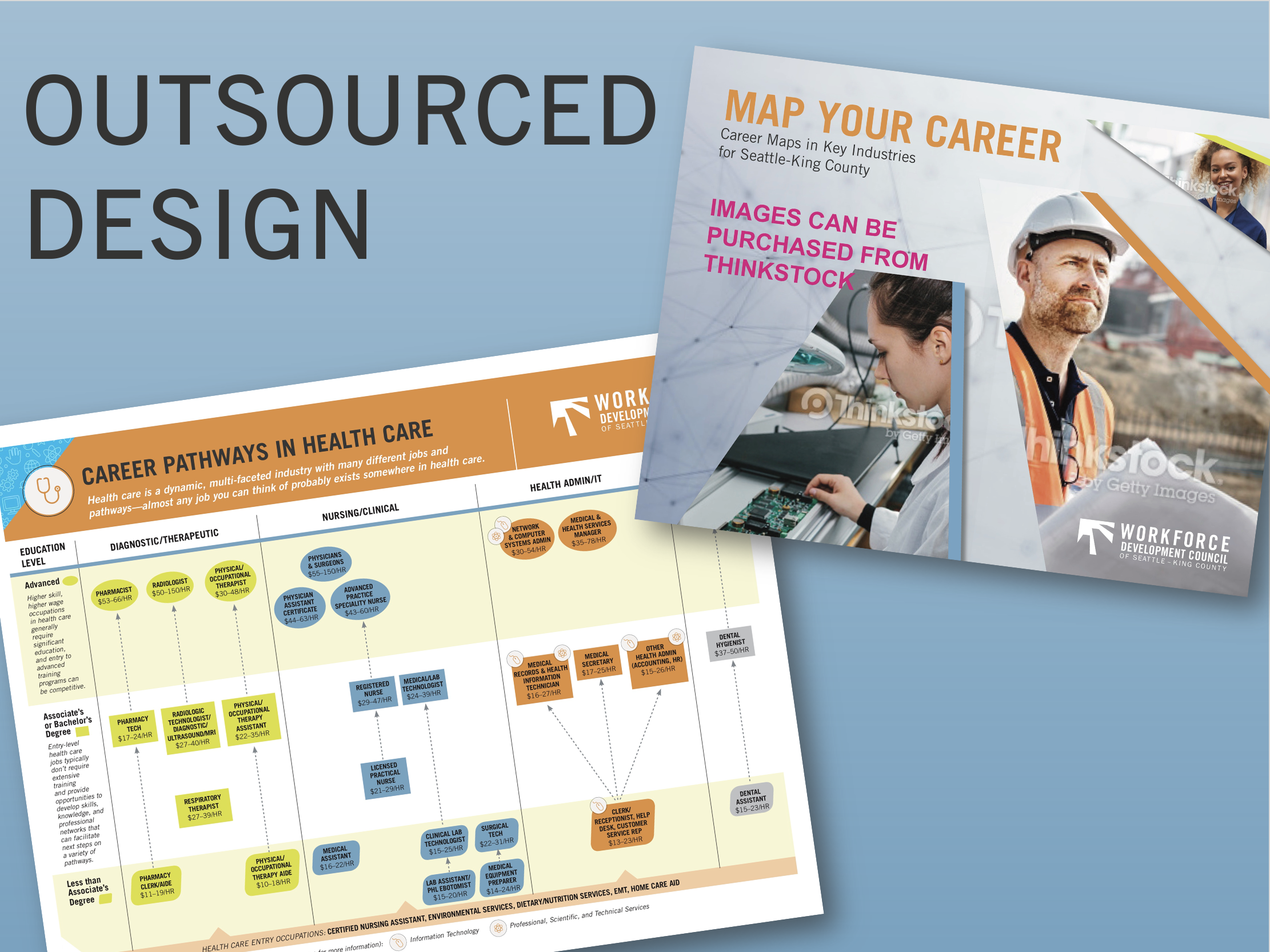
The consultants’ mock-ups for a redesign were not entirely bad. The design was more sophisticated but the improvements were surface level, cleaning up the lines and angles but clearly living inside the mental model of the original. No version had considered a storytelling approach aimed at a young audience nor reflected the feedback we received from industry experts that career pathways were often less linear, zigzagging across disciplines as individuals acquired credentials and on-the-job experience that changed their perspective.
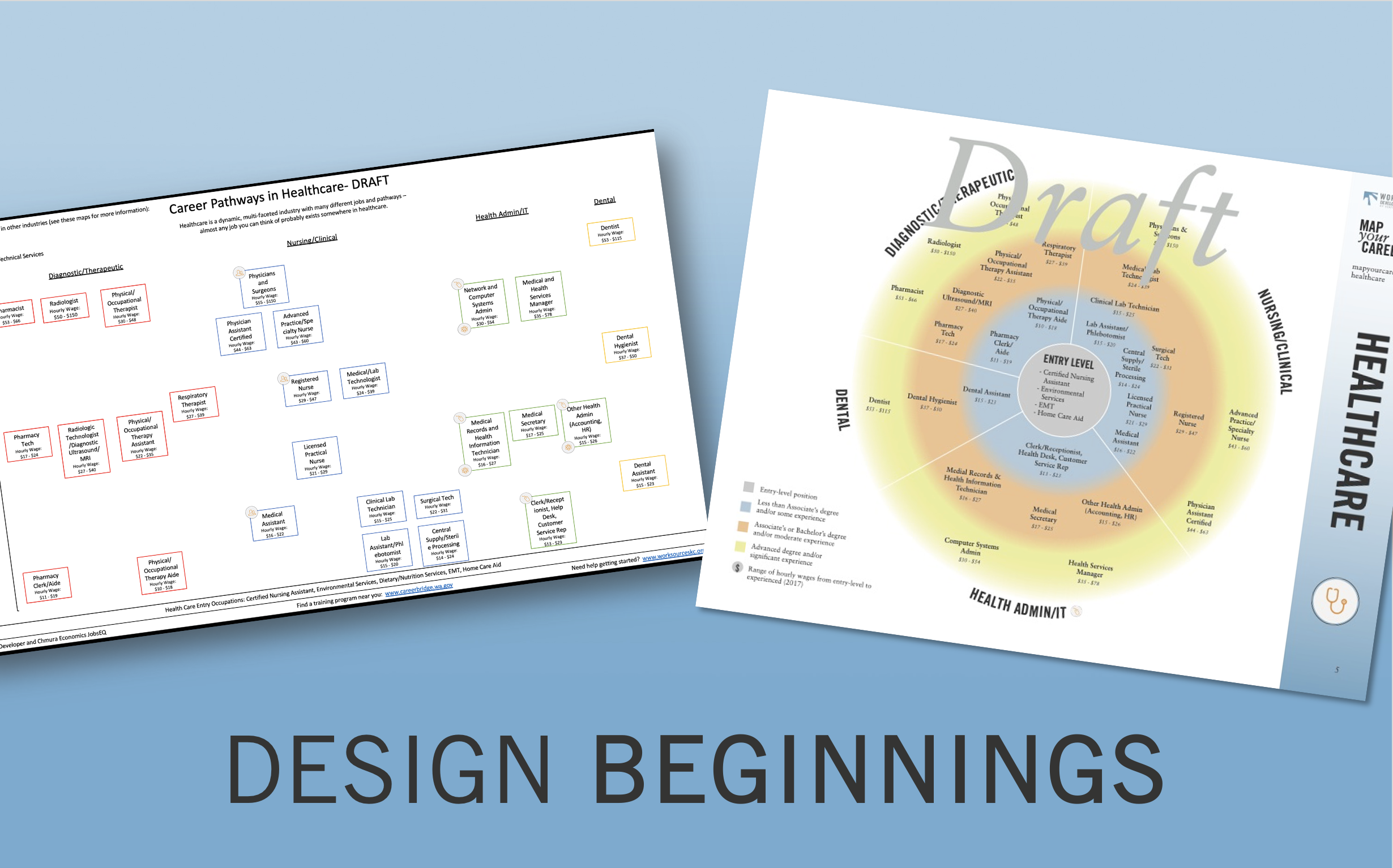
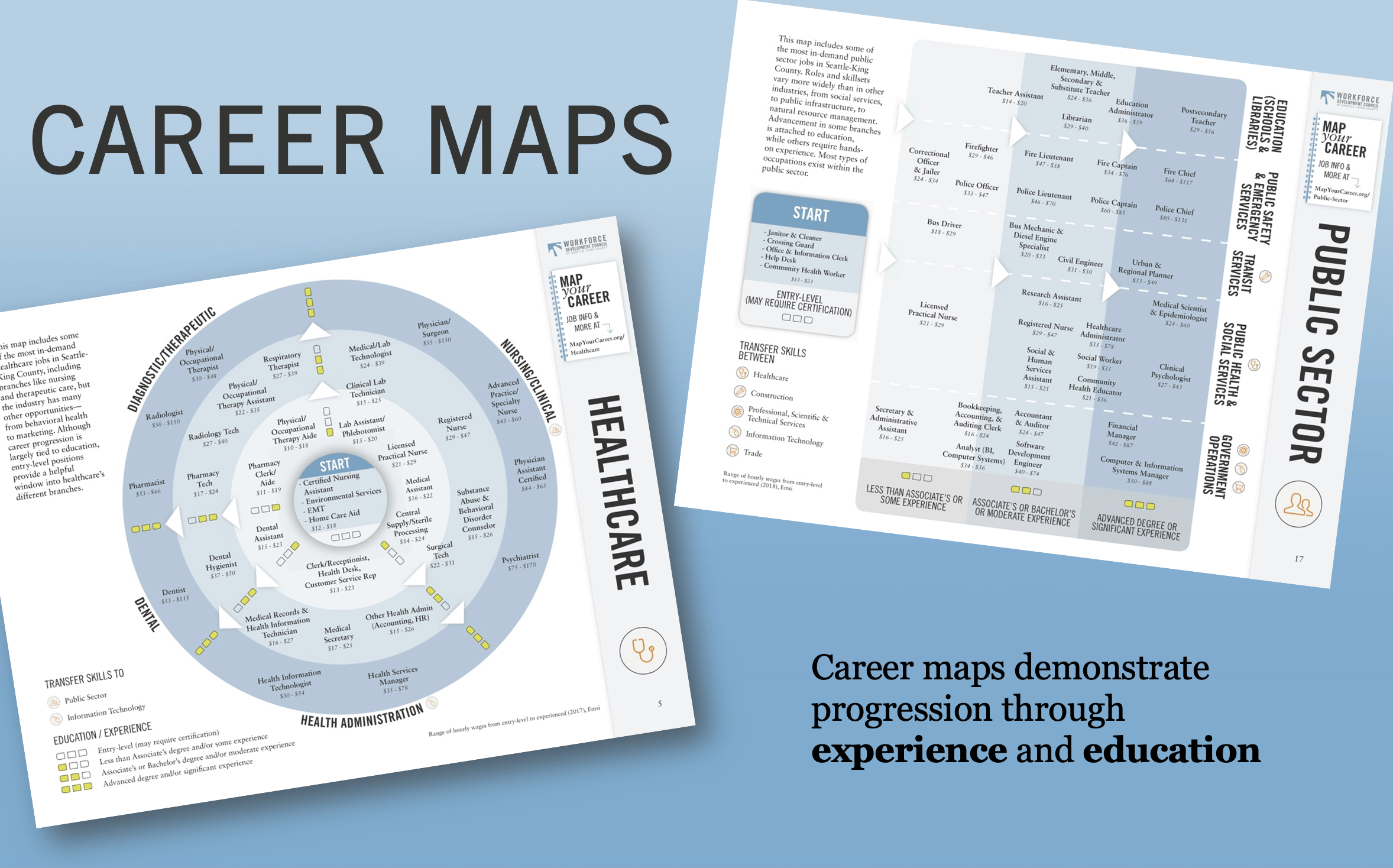
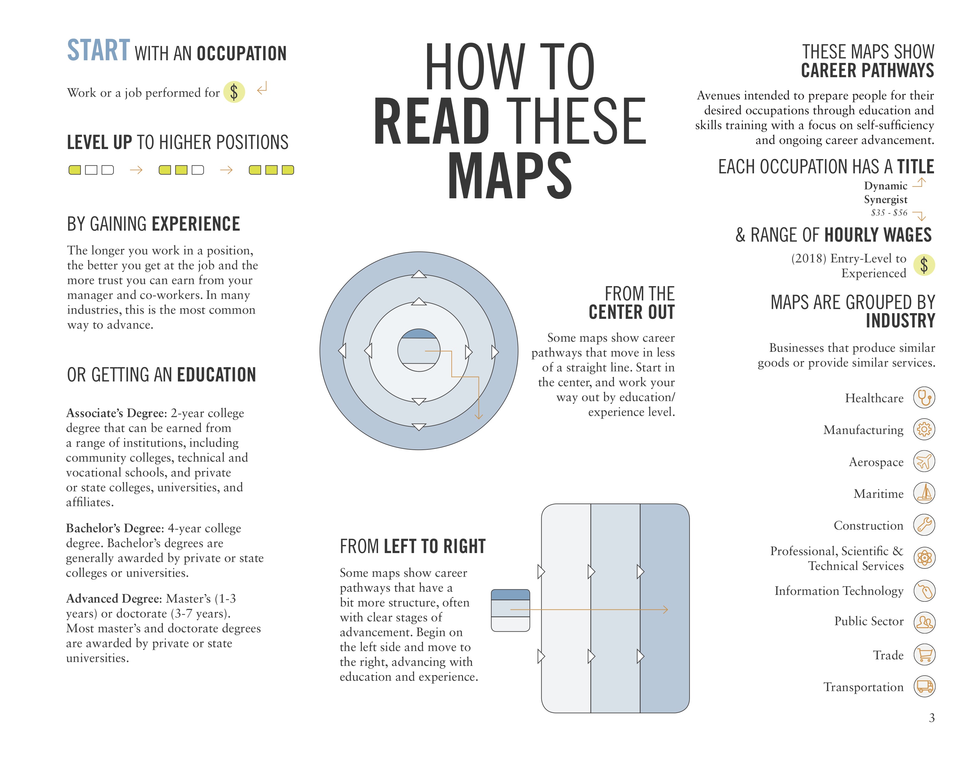
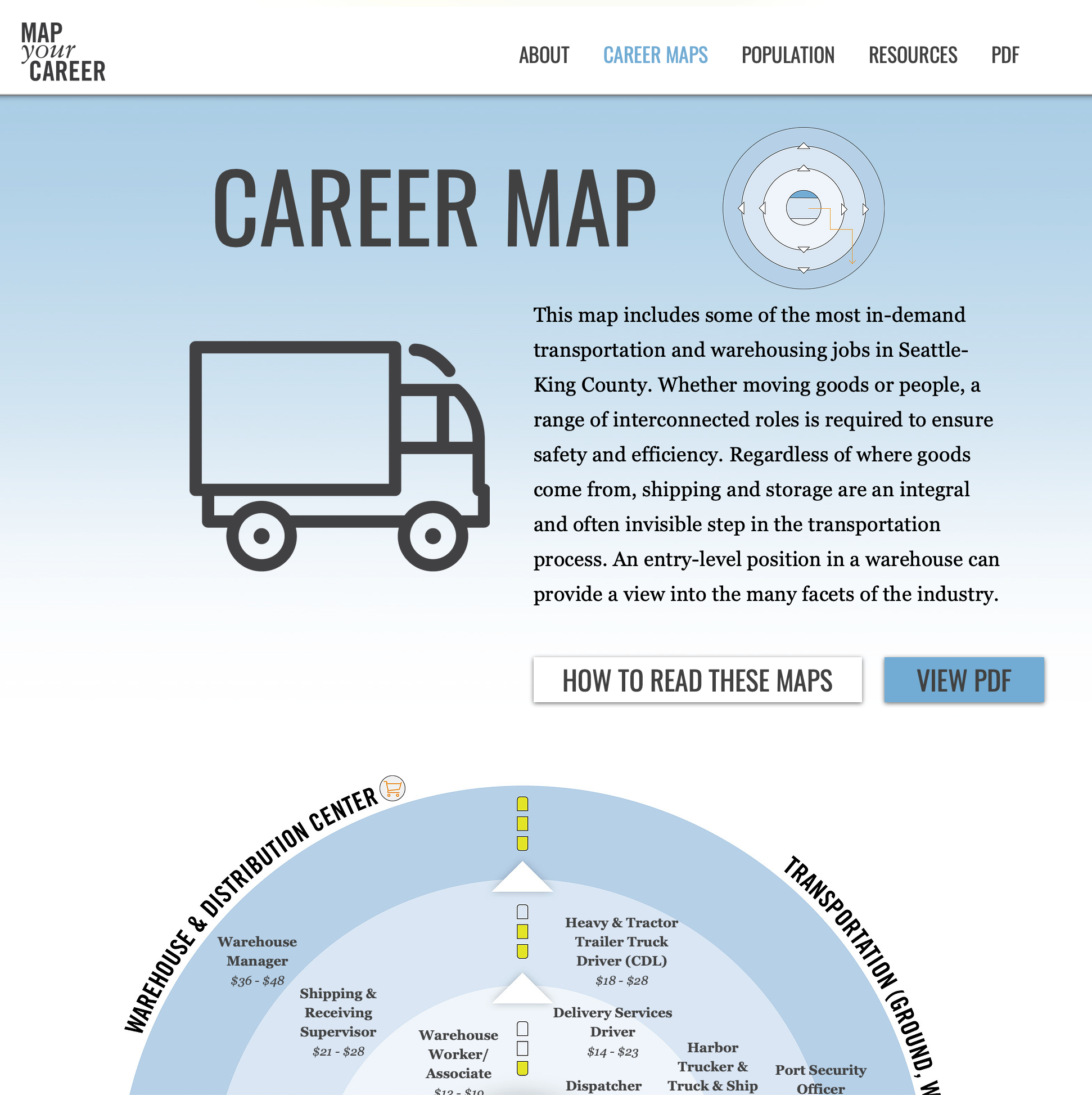
Partnering closely with a data analyst, I began drafting frameworks for the career pathway visualizations. We arrived at the concept of a circular map loosely based on a board game, looking for more flexibility to show non-linear pathways. We went through several iterations, but this early design work heavily informed the final product and was only made possible by the collaborative storytelling effort between data and design.
Creating a New Visual Identity
At the same time, I had begun my own process of design discovery, independent from the data visualization process, to identify a fun, youthful visual language that could form the basis for a book cover, worksheets, and eventually the website. In thinking about the audience, I reflected on my own experiences in high school and college, not sure what my career path would be.
Rather than presenting Map Your Career as a set of instructions down several predetermined paths, I wanted to embody creative possibility and ownership of one’s future. I took inspiration from imagery and brands that spoke to these themes, particularly drawn to the simple visual language and use of color employed by Nintendo in their Labo line of build-it-yourself carboard “Toy-Cons”—about as far from a career mapping exercise as you could get.
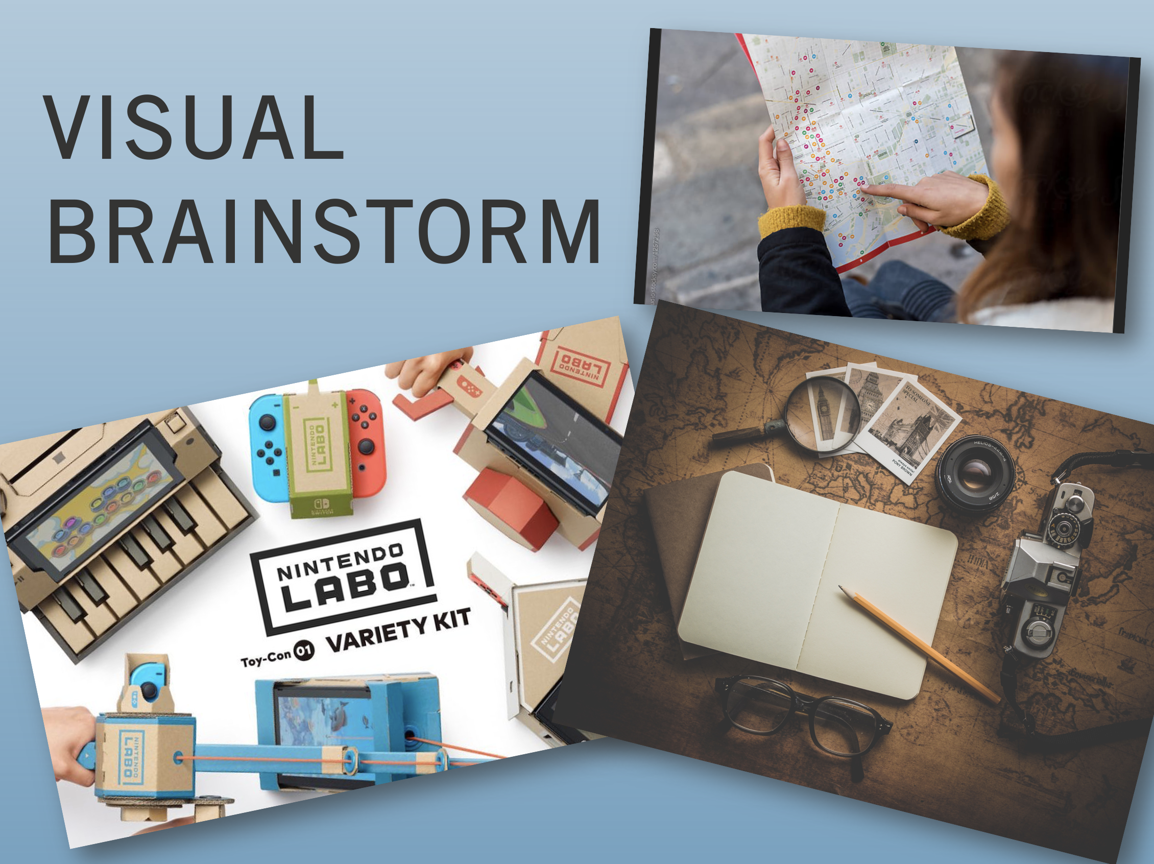
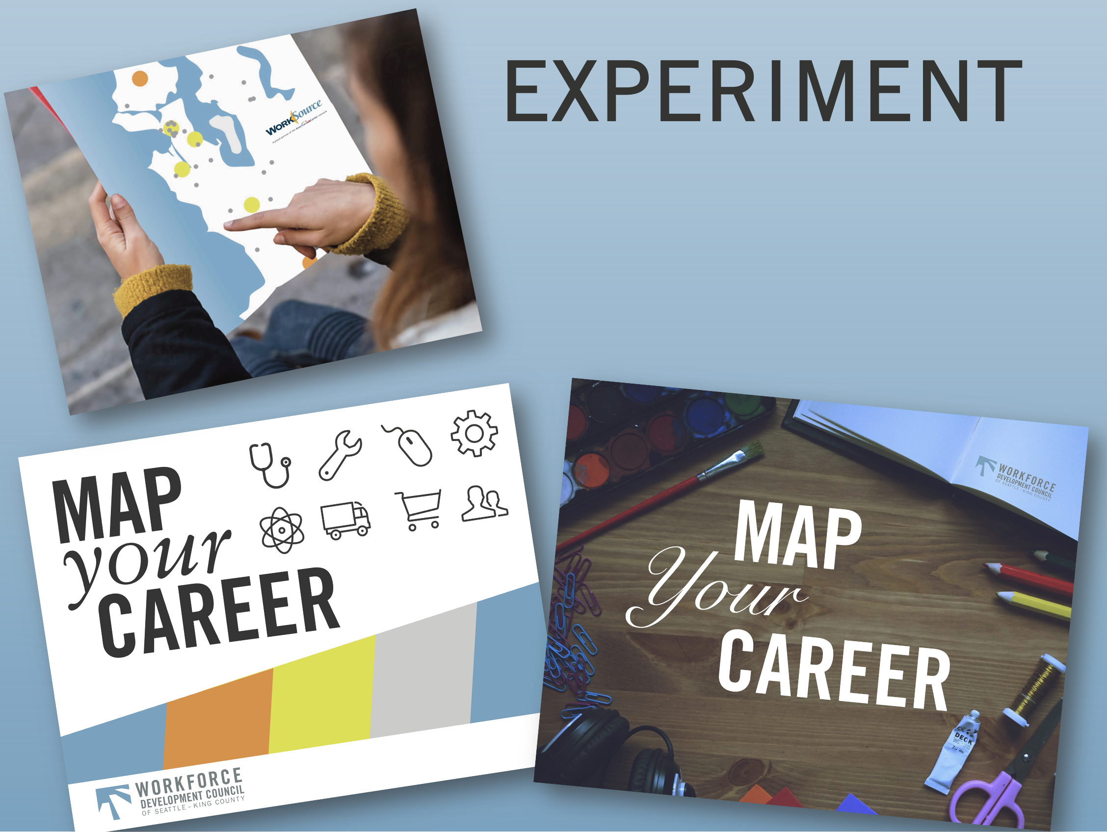
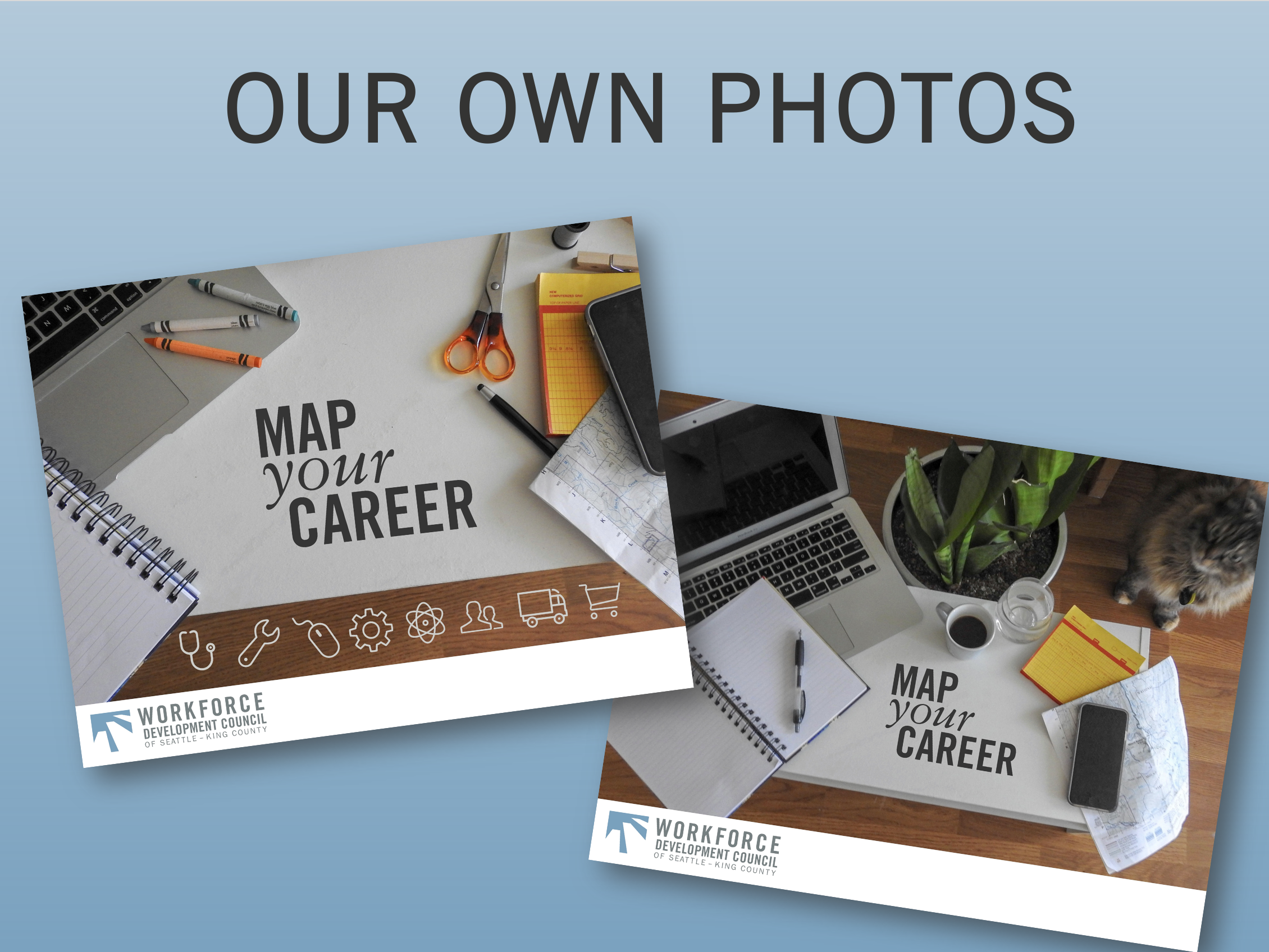
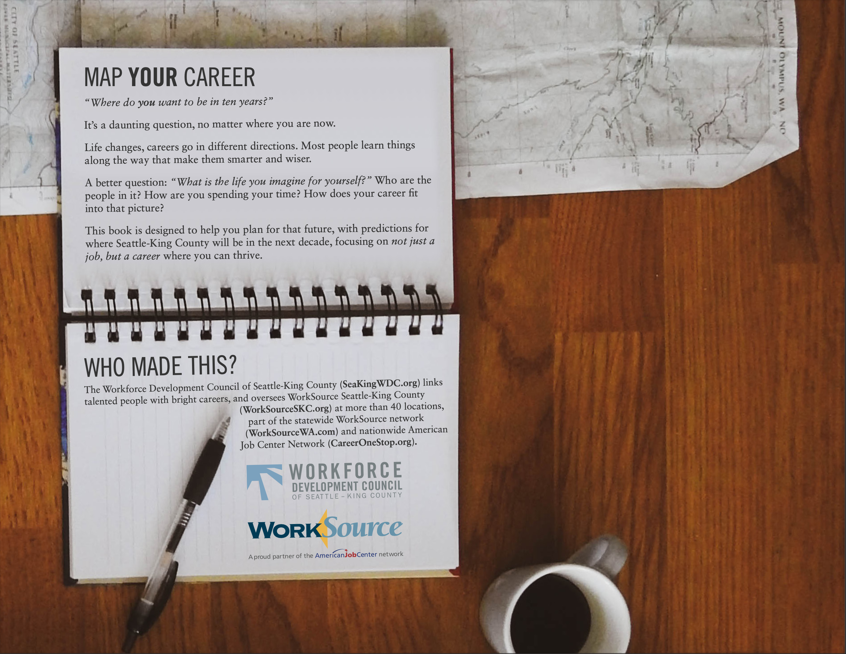
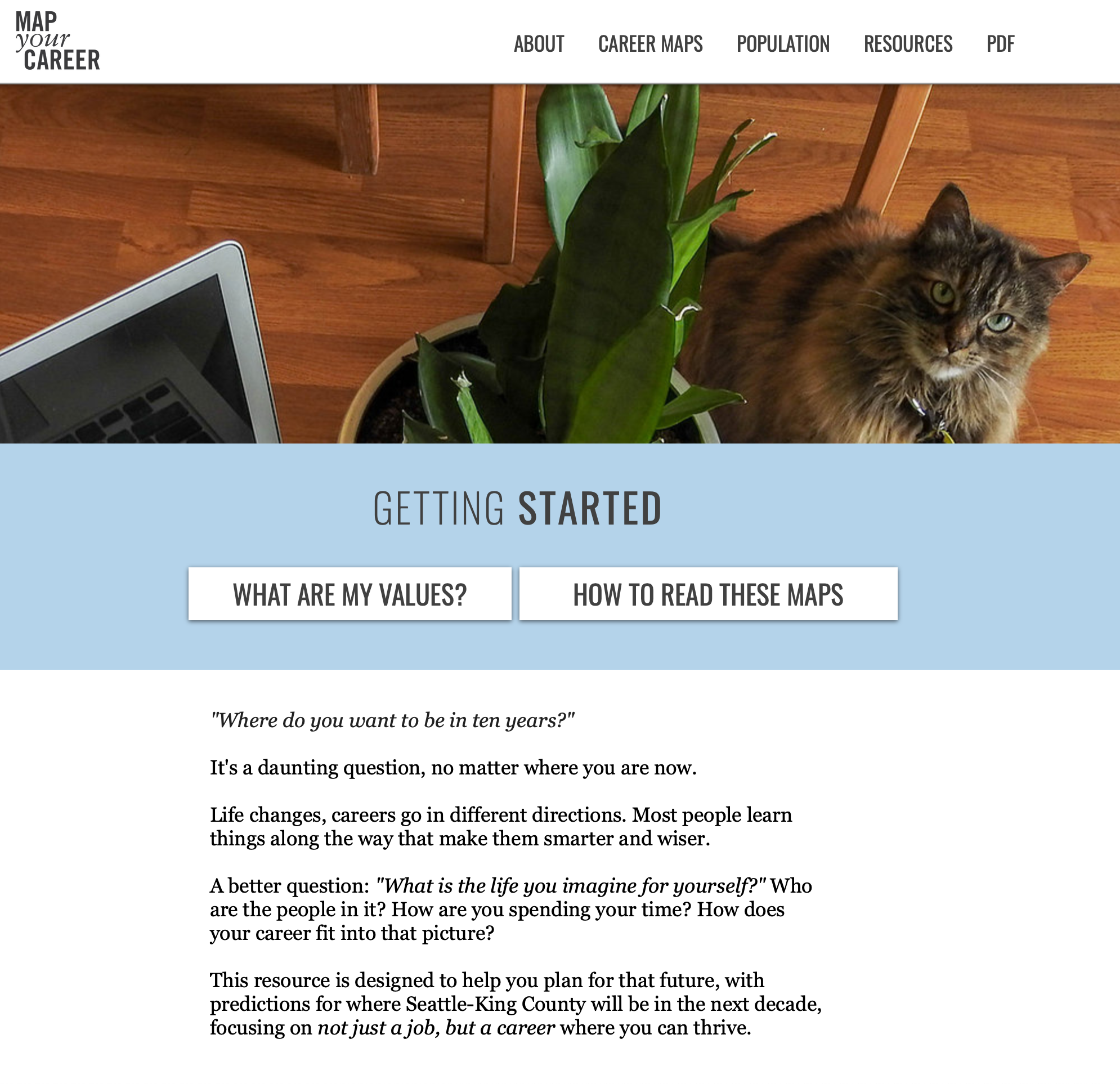
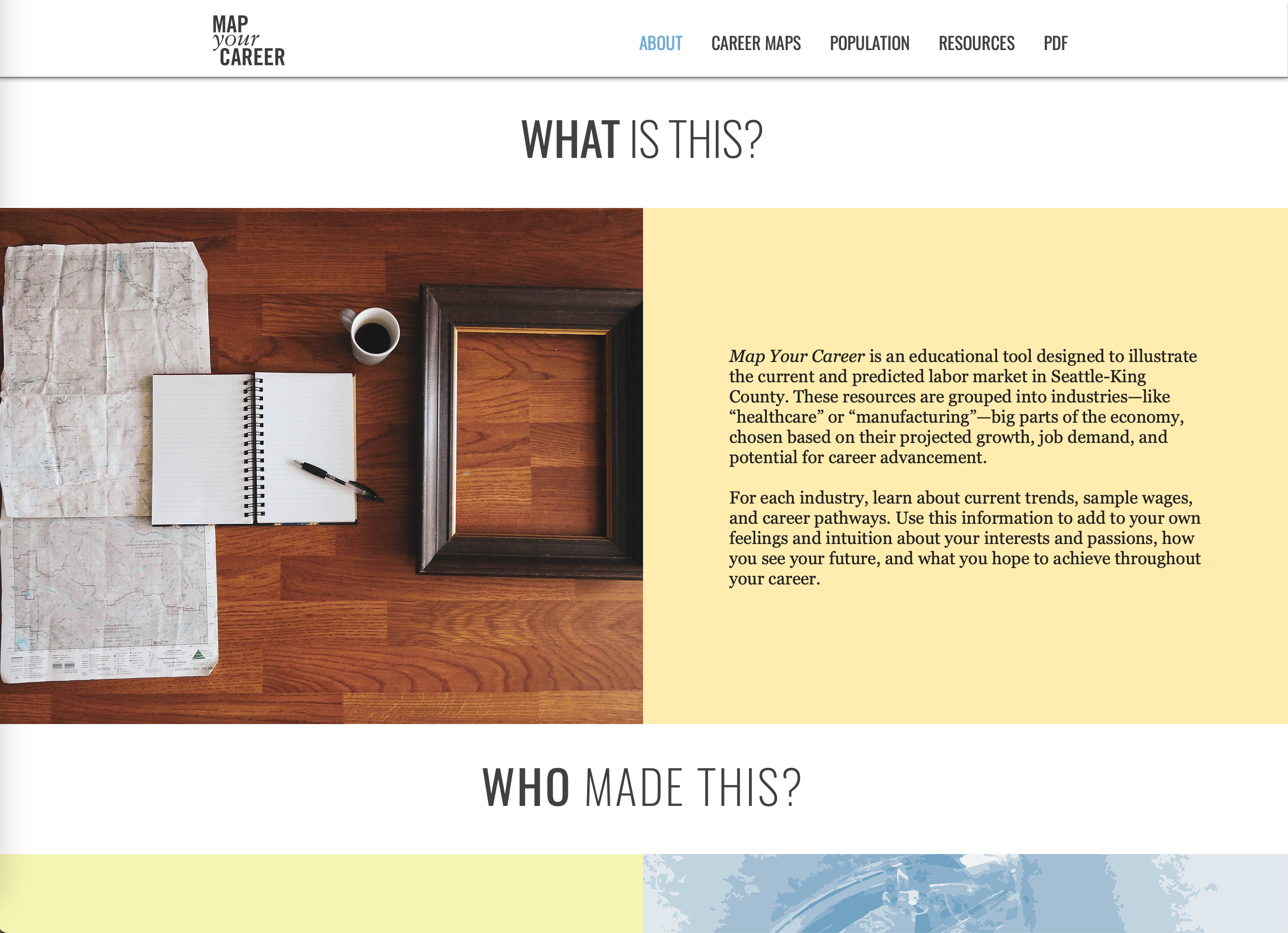
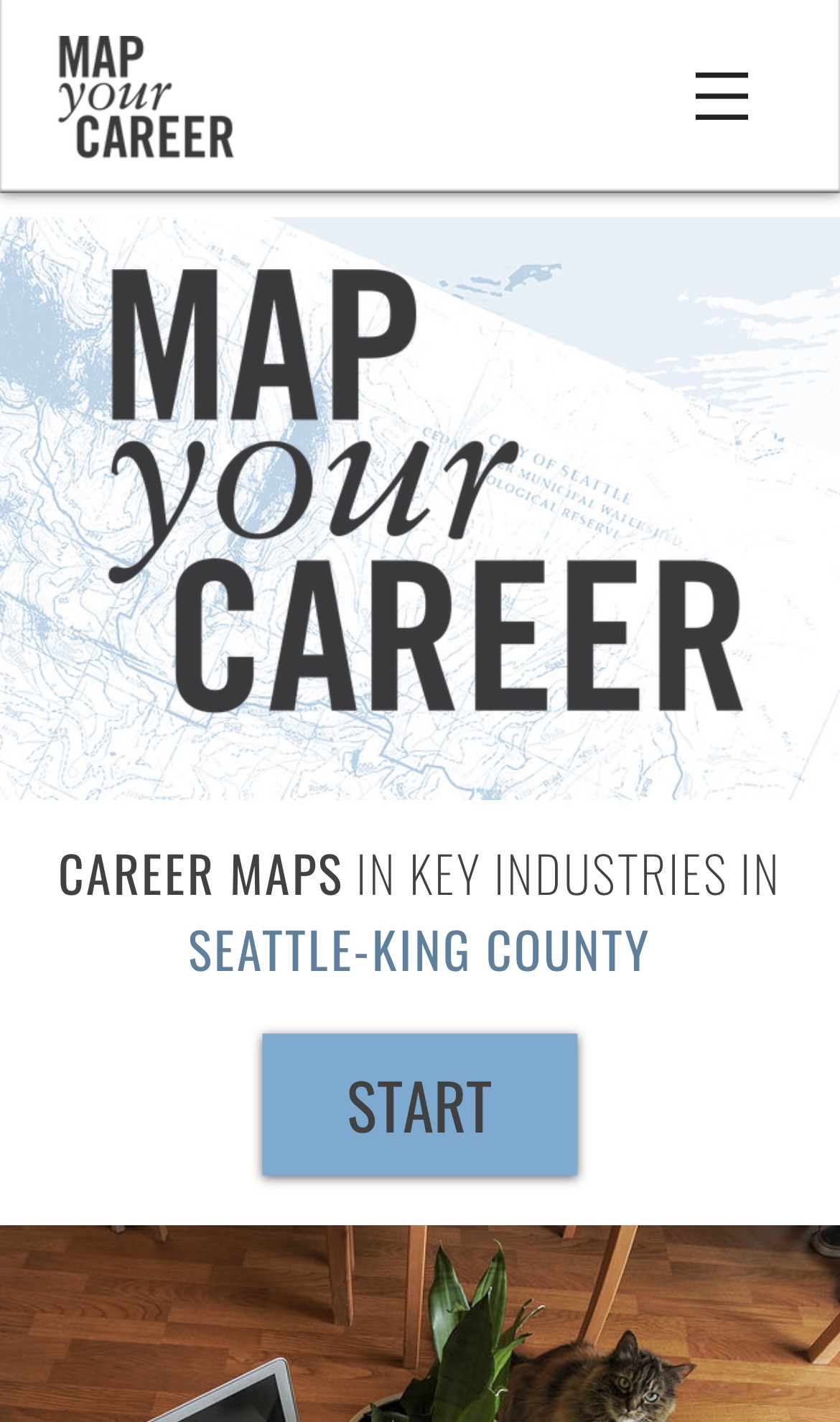
Once we had a sense for the theme, we conducted a photoshoot in my colleague’s living room, choosing to stage objects representing creative process and the idea of “work” but decoupled from an industrial or office setting. In the middle of this, my colleague’s cat Maggie wandered into the scene and inadvertently became the mascot of the entire project. It was a random detail that gave life to a series of static objects, but Maggie’s natural curiosity also reflected the sense of wonder we were hoping to bring to life. We floated a few design mockups with a focus group of student program participants and the versions including Maggie were clear favorites.
Design Wilderness
We eventually had a working draft of the entire book, but in a presentation to the CEO, she found the less linear structure of the career maps to be too confusing, and the color contrast was contributing to a sense of anxiety. After months of work, we were told to go back to the drawing board.
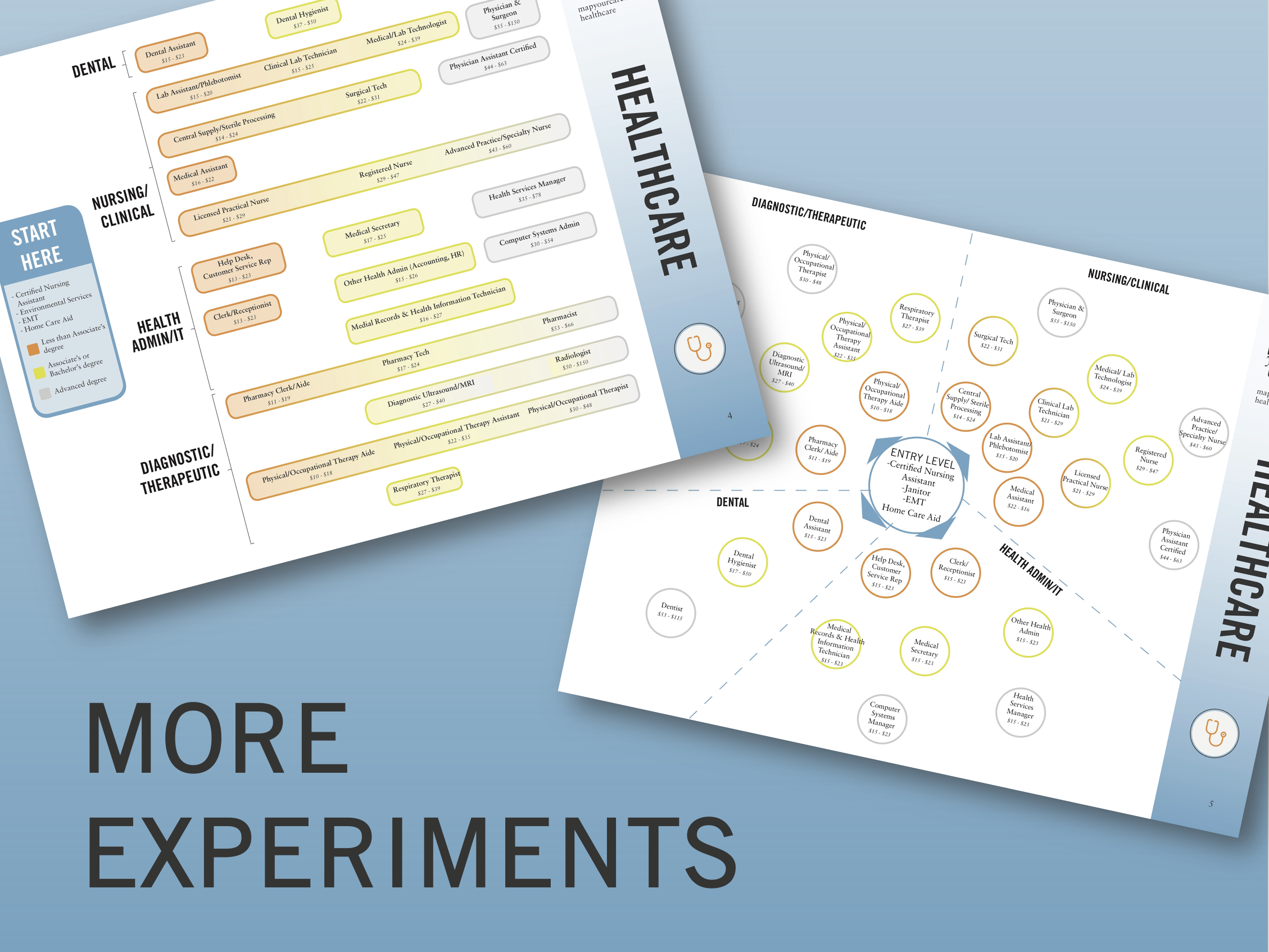
At first this was disheartening—we had already spent months on the project. But I soon realized the feedback and extension was a huge gift to the creative process. By forcing us to re-evaluate, conduct more targeted focus groups, and meet with additional subject matter experts, we were provided a freedom to explore that generated new concepts and helped polish and iterate the design.
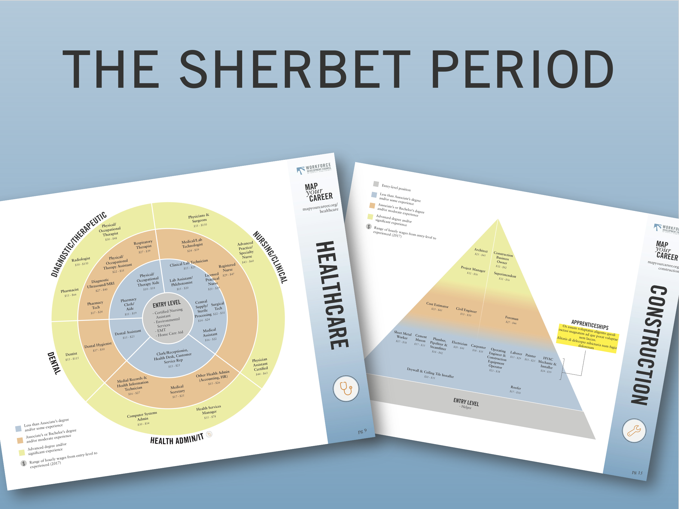
I leveled up the board game influence, developing iconography to clearly denote experience and education, and using shapes and color to draw the eye toward the natural starting point. By shifting to a series of calming blues, the colors denote progression instead of serving as distraction.
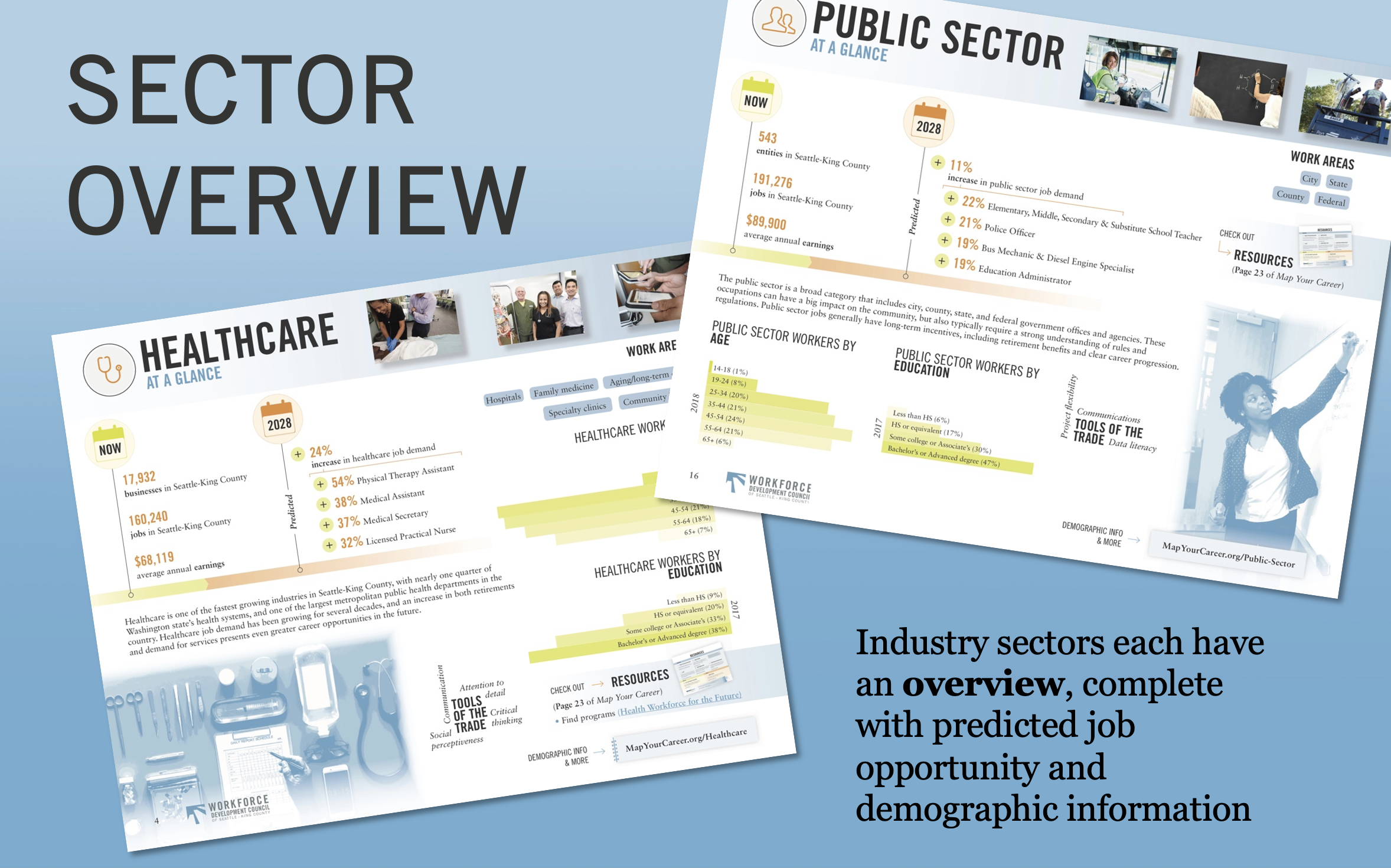
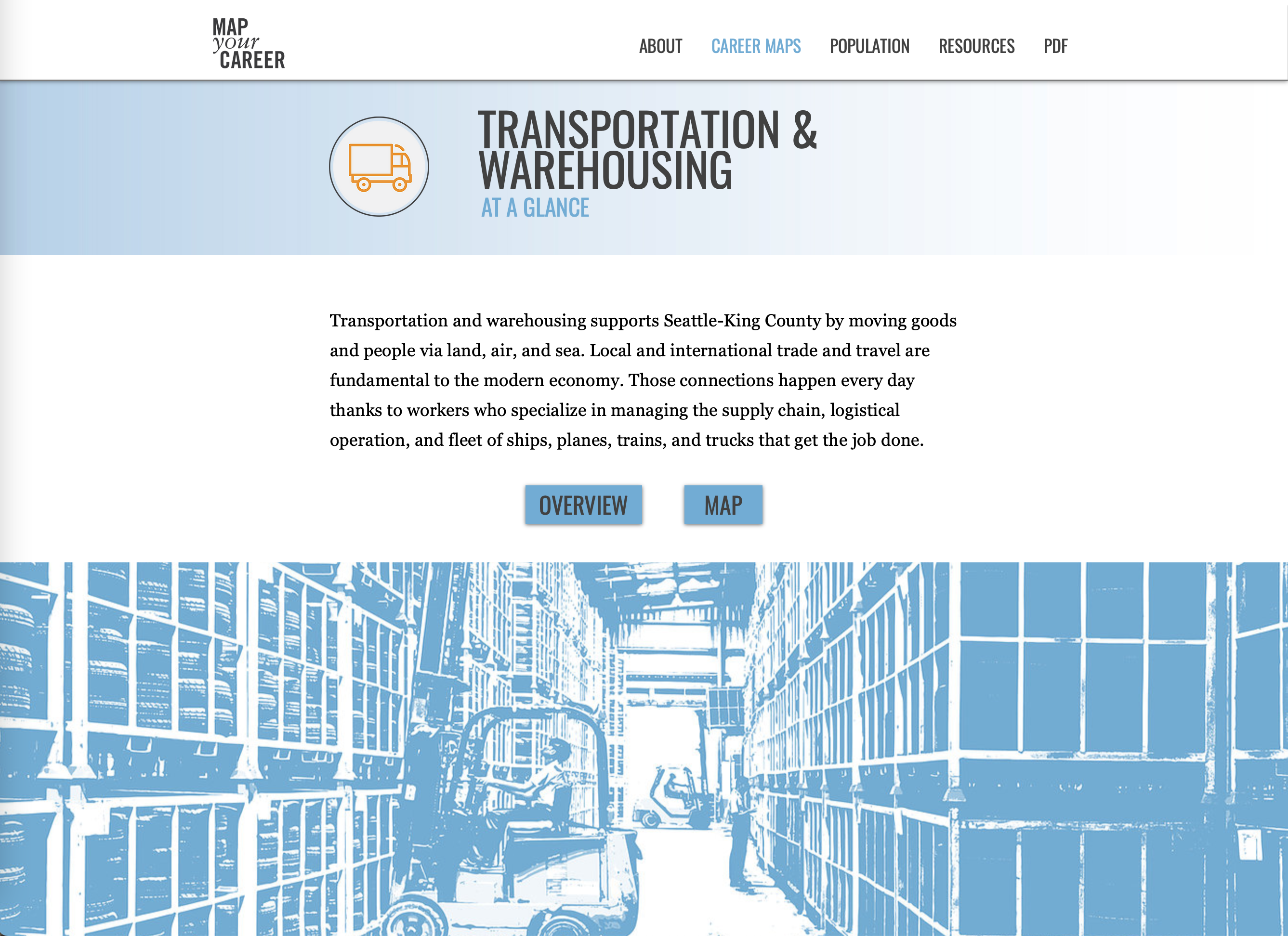
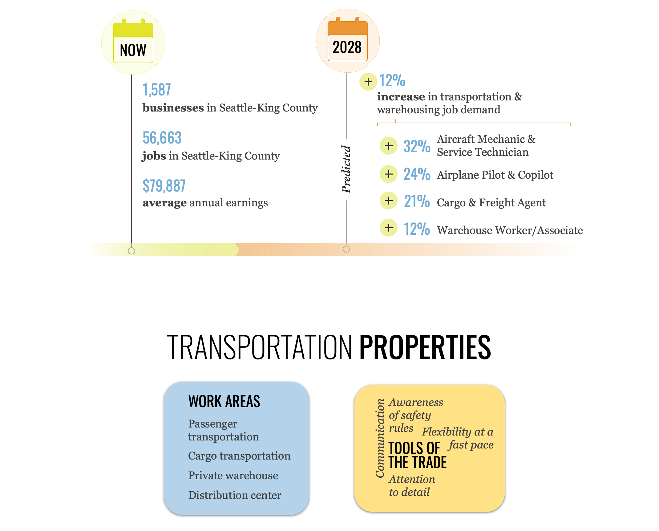
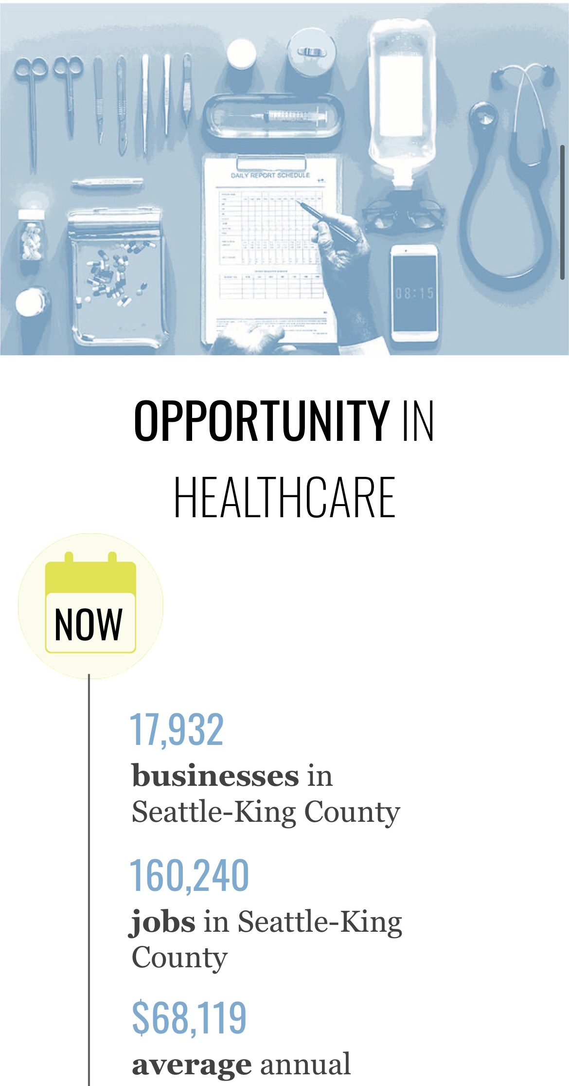
In addition to designing the maps themselves, we also needed to create summaries to reflect high-level data about an industry that made it viable for someone looking to start or change careers, using 10-year labor market estimates as a guide. For these we incorporated simple approaches to showing relevant data and decided to omit some data which was better viewed in an online dashboard. I created stylized images to complement the abstract maps, and to ground each spread in a visually distinct portrayal of the work environment. These details may seem superfluous, taking up valuable printed space, but they provide a cohesion to the project and lend well to the web adaptation.
Honing a Voice
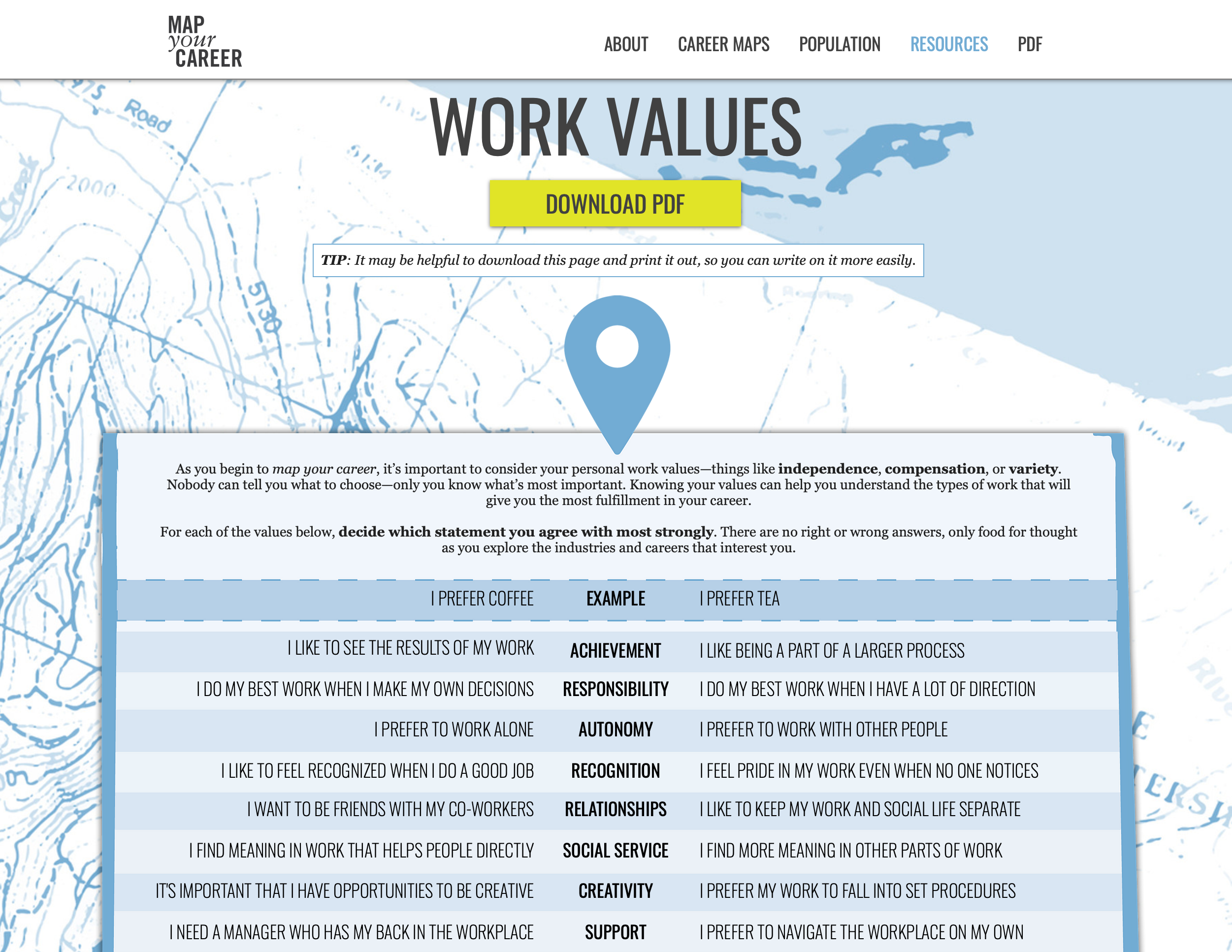
Because of the focus on a school-age audience, it was important for Map Your Career to include an exercise that could be used by a classroom instructor to facilitate discussion. The previous version had included an activity worksheet composed of blank fields to fill in a career pathway “ladder.” This reinforced the linear pathways we were trying to get away from, so instead we opted to build a series of values-based exercises with a focus on starting conversation in a classroom and building good job search and networking strategies.
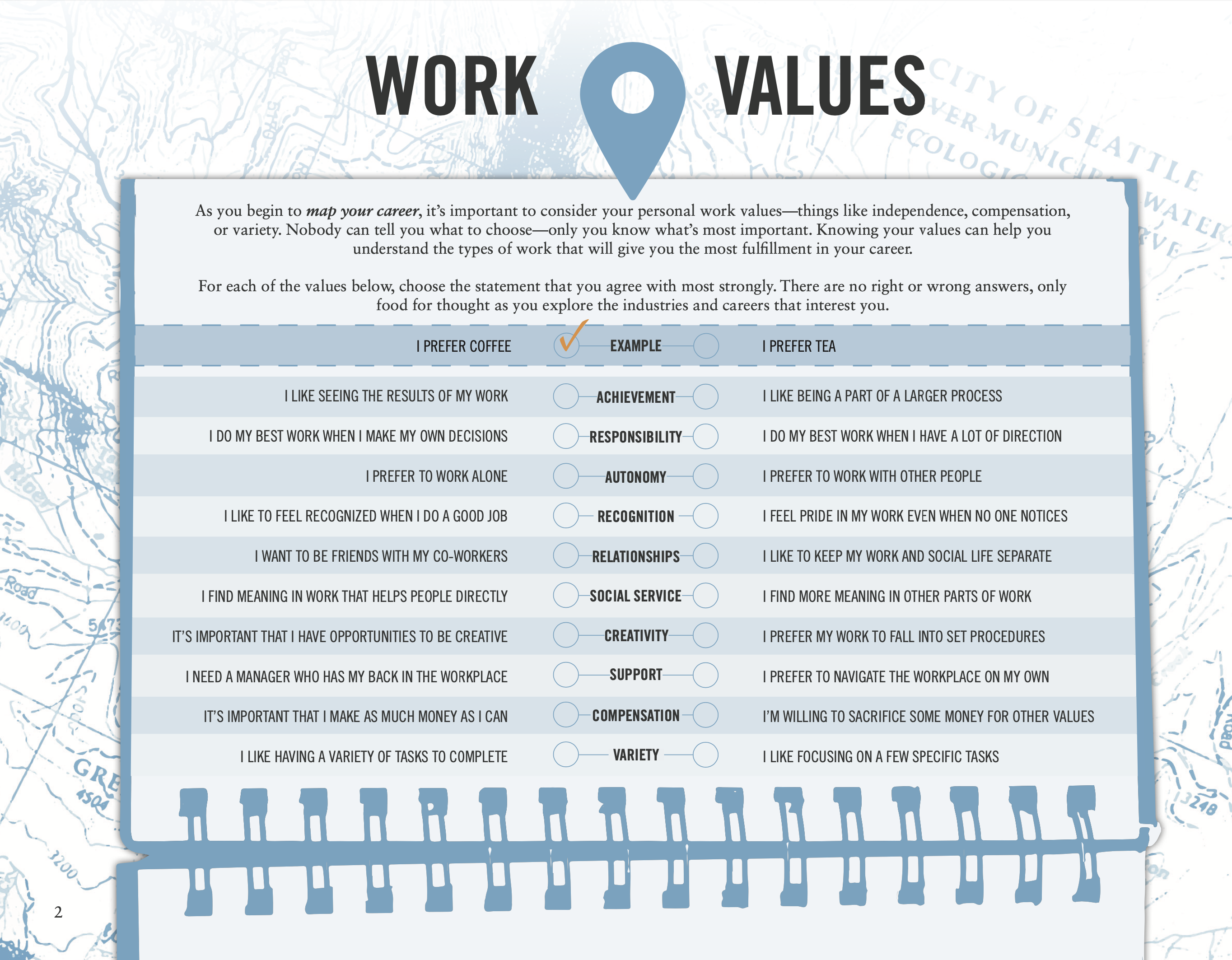
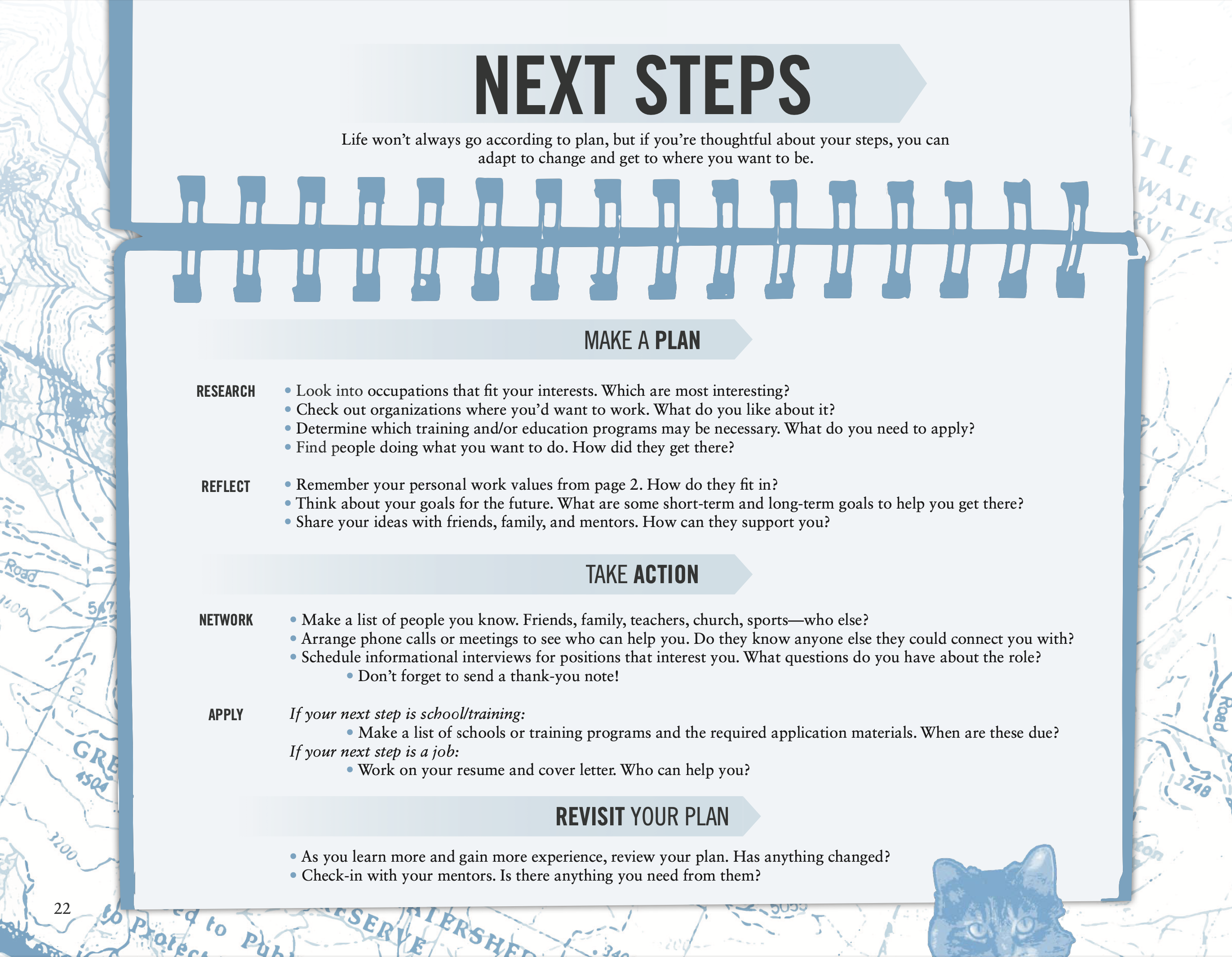
We referenced several existing bodies of research and developed an exercise with no right or wrong answers, striking a careful tone to embody each value without imposing judgment. By centering the exercise on values, we settled on a voice that echoed the calming blues of the visual design with simple, straightforward language that was honest about career planning without being patronizing or jargon-y.
Finalizing the Web Version + Rollout
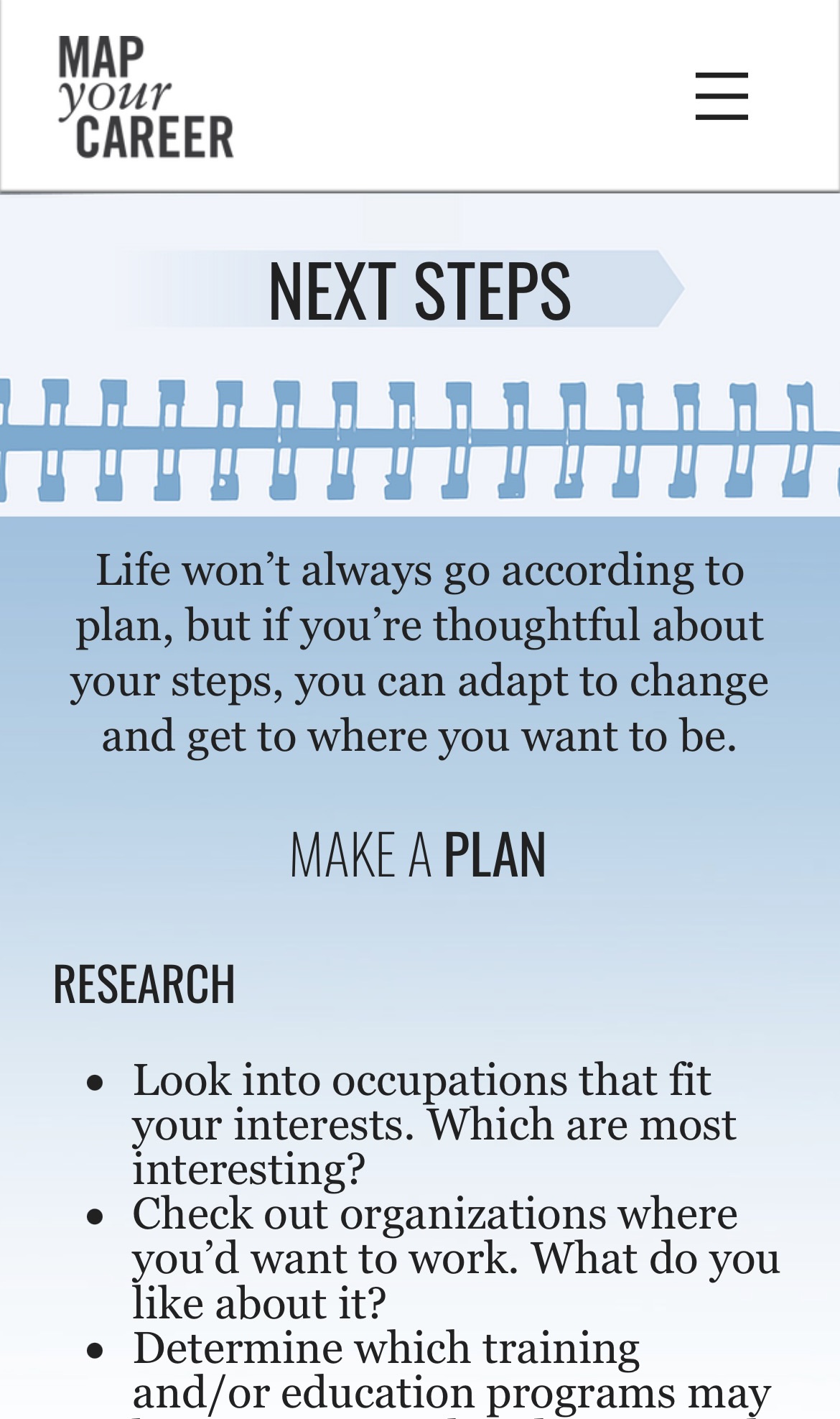
Once we had finalized the data, design, and voice, I began the work adapting what we had built into a mobile-friendly website, knowing that was the mostly likely way the project would be experienced. This process was daunting, but even given the challenge it only took a few weeks to adapt the design concepts into a website format.
After the website was finished and the print version was ready to be distributed, we hosted a short webinar with community stakeholders to go over the process and introduce the redesign, and overall it was well-received. The print/PDF version was picked up quickly by King County classrooms, and in the two years since launch we have had to do several re-prints to supply K-12 educators. For the web version, a happy trend has emerged: the Work Values worksheet regularly leads web traffic alongside the major industry pages, indicating the classroom resource is being used as we had hoped.
In addition to schools, trade groups representing healthcare, maritime, and manufacturing have adapted versions of the maps to guide their own internal advancement pipelines. Map Your Career was beta-tested inside healthcare organizations to identify best practices for internal worker advancement, sparking an ongoing conversation and shared planning between smaller healthcare providers around medical assistant apprenticeships.
While previous versions of Map Your Career only lasted a few years before becoming visually dated, this redesign has stood up well, and continues to be used to this day.
